Data Byte
Estimated time to complete: 45 minutes

Estimated time to complete: 45 minutes
The Earth Systems Research Laboratory’s Global Monitoring Laboratory of the of the National Oceanic and Atmospheric Administration (NOAA) conducts research that addresses three major challenges; greenhouse gas and carbon cycle feedbacks, changes in clouds, aerosols, and surface radiation, and recovery of stratospheric ozone.
Visit this page to begin exploring datasets:
Locate the “Research Tab” within the blue header banner and choose “Ozone and Water Vapour” and click on the tab to bring you to the landing page.
In this Data Byte you will be exploring Ozone data at Tudor Hill Atmospheric Observatory in Bermuda. Locate the grey circles on this page to select “Datasets. The page will relocate the user to a list of all Sites that various Ozone and Water Vapour data are collected.

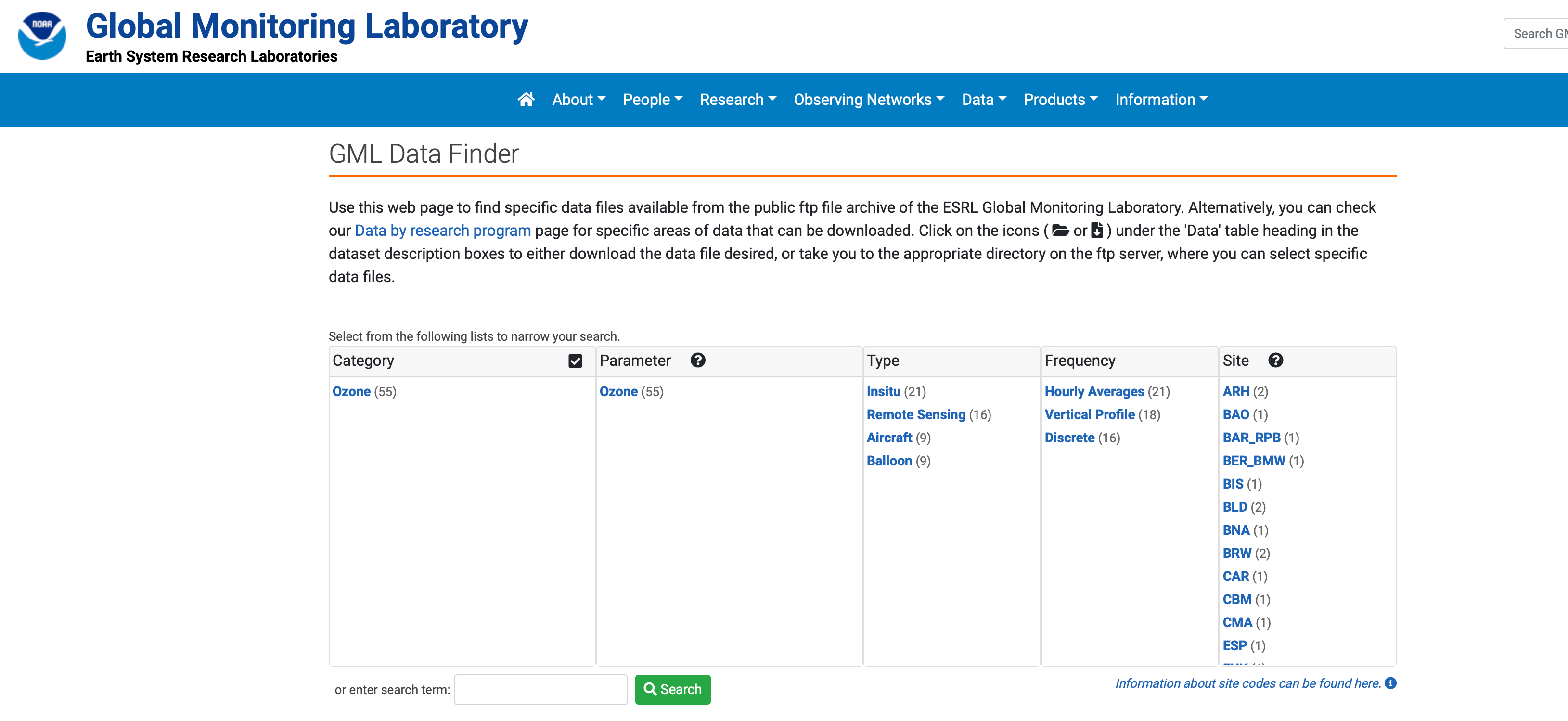
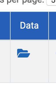
Select from the list the code BER_BMW from the Site List, or utilize the Search function and type “Bermuda” and be routed to “Tudor Hill, Bermuda, United Kingdom (BER_BMW). Select the file folder icon under the column heading “Data” to explore all data existing in the repository for this site. Explore the data files to learn more about the timing of data collection and how metadata is recorded.

Metadata is the information stored alongside data that make it accessible, including how the data was collected and processed, the parameters collected, instruments utilized and who collected the data.
Explore the folders to discover how annual data is collected, under what time intervals and units. It is important to understand the metadata to make sure the dataset is consistent before downloading for analysis.
In the metadata provided in the data files for station BWM what are the units that Ozone (O3) is measured in?
When looking at the 2014 folder for station BWM, what are the two time intervals of sampling that the metadata describes?
Any of the datasets explored could be imported into Microsoft Excel for manipulation to better understand annual and inter-annual trends in surface Ozone. In this lesson, participants will practice bringing in the data from the NOAA data repository into Excel.
First, choose a year and month that you are interested in exploring. In this example, January of 2021 was chosen. Highlight the entire dataset and utilize control “C” or Command “C”.
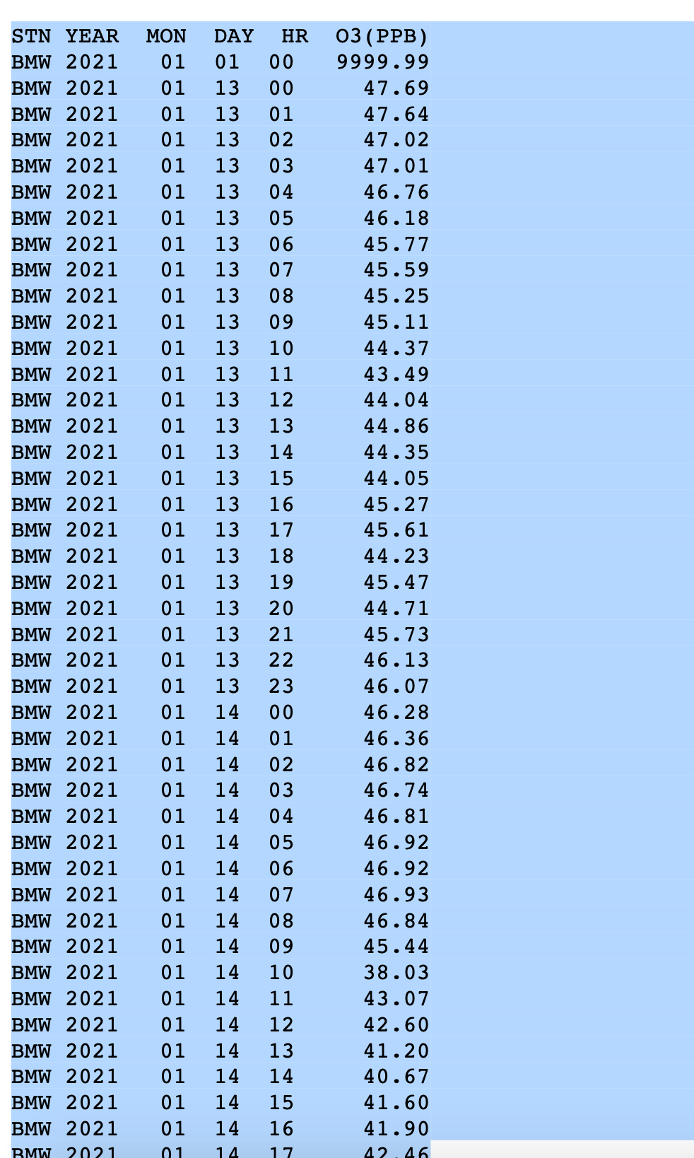
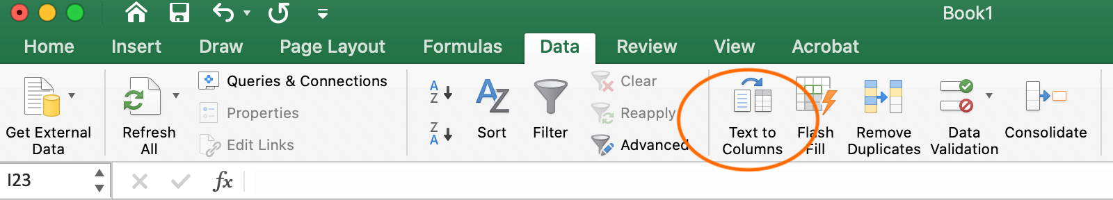
Open a Microsoft Excel workbook or free version (eg. LibreOffice) and paste or paste special (shortcut: “Control V”, “Command V”). Due to data being stored in the repository as a text file, all the information will copy into one column. The Text to Columns function located under the “Data” tab in Excel will allow you to separate the data by delineated column width so that each piece of metadata heading has its own associated column. The text to columns function becomes very useful for importing data in repositories that is stored text format.
With an understanding of how the datafile was originally constructed by pulling NOAA data from the repository, the next step is to import a curated .csv file. A CSV file is a comma-separated values text file, which allows data to be saved in a table structured format.
A curated .csv dataset for Ozone can be downloaded below and contains hourly ozone measurements (PPB) at Tudor Hill Marine Atmospheric Observatory.
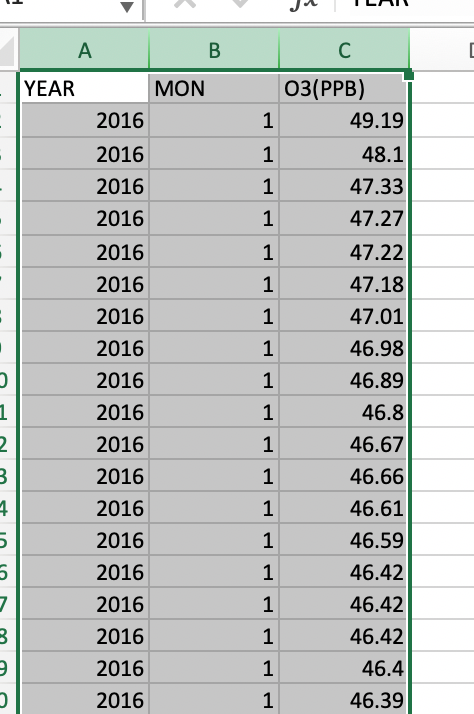
Click on the button to download the file and open this as an Excel file and save a copy of your data sheet. If the file does not open with each parameter in its own column, proceed to utilize the “Text to Columns” function. Please note that the first column is the year the data was collected, the second is the numerical month (eg. January = “1”) and the Ozone measurement in parts per billion .
The first thing to explore in the data is to see the range. You can calculate the maximum value by utilizing a few simple commands.
In the function bar at the top of your screen calculate the maximum and minimum values.
An alternate way in Excel to calculate this is found under the AutoSum function on the Home tab: here you can see a Max and Min function.

What is the maximum Ozone value (PPB) in the entire dataset?
What is the minimum Ozone value (PPB) in the entire dataset?
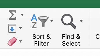
Utilizing one additional function to explore what month these values occur in. Copy the maximum value found into the dataset into the “Find & Select” function on the Home tab in Excel.
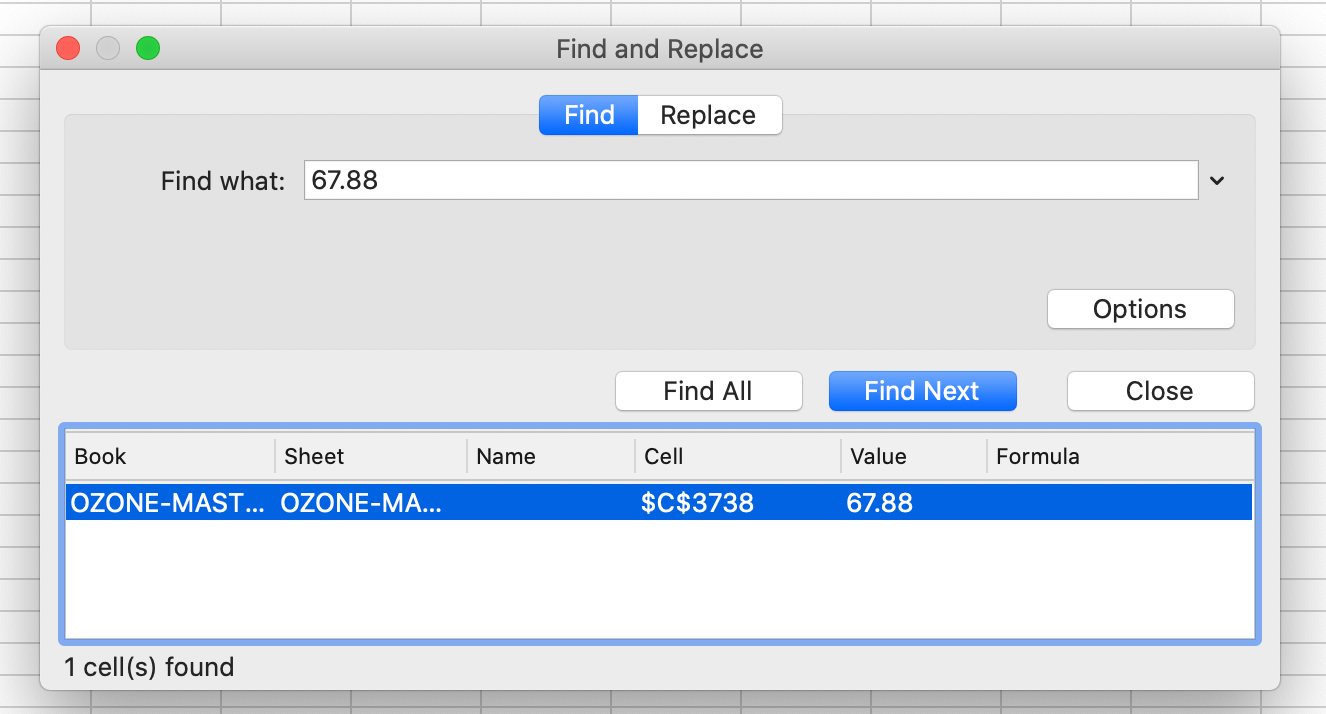
Locate both the minimum and maximum values utilizing the Find & Select function to answer the question prompt below.
In what month does the highest Ozone value (PPB) occur in the dataset?
In what month does the lowest Ozone value (PPB) occur in the dataset?
A pivot table is a table of grouped value that will summarize or aggregate individual items into table with one or more discrete categories. The summary table has the ability to create sums, averages or other statistics, which the pivot table can group together using a chosen aggregation function that is applied for the grouped values.
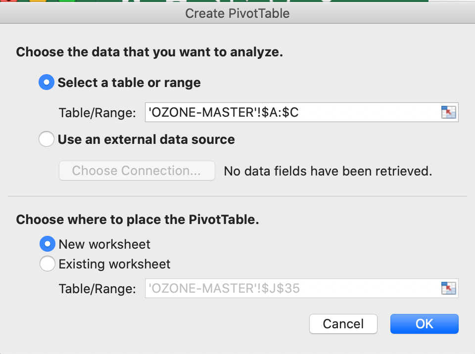
To insert a pivot table first highlight all three columns of summary data by clicking Column A, B and C while holding “Shift”.
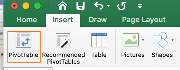
Locate the “Insert Tab” on the top bar of Microsoft Excel and select “Pivot Table” which is the first icon. A Create Pivot Table window will open and confirm the correct data range has been highlighted for the summary. In the query section choose where to place the PivotTable, choose “New Worksheet”. Analysis of the data should be completed in a separate worksheet, to prevent any alterations to the original data file.
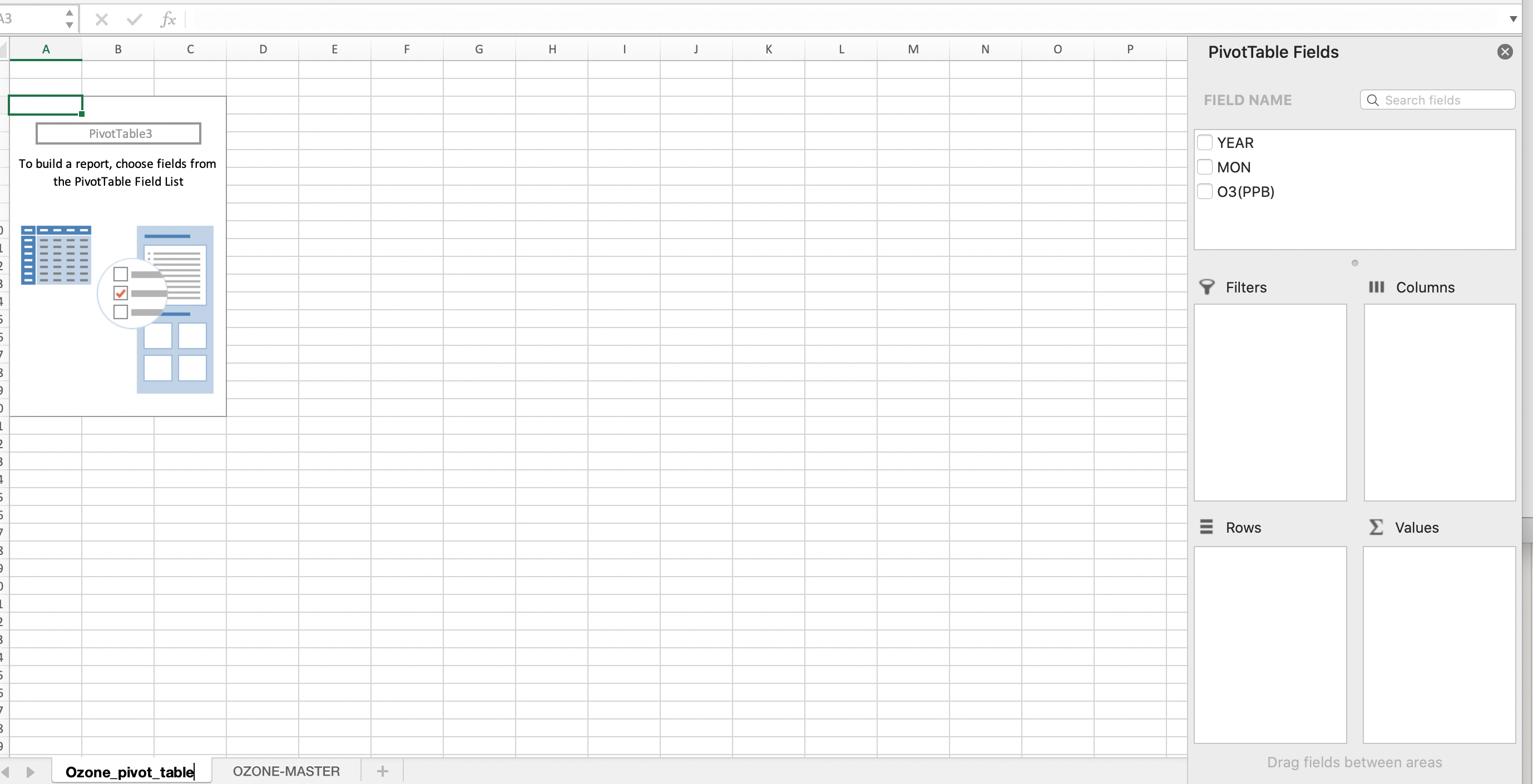
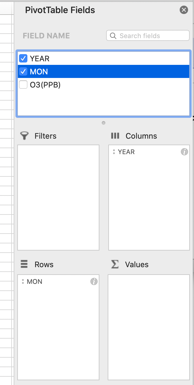
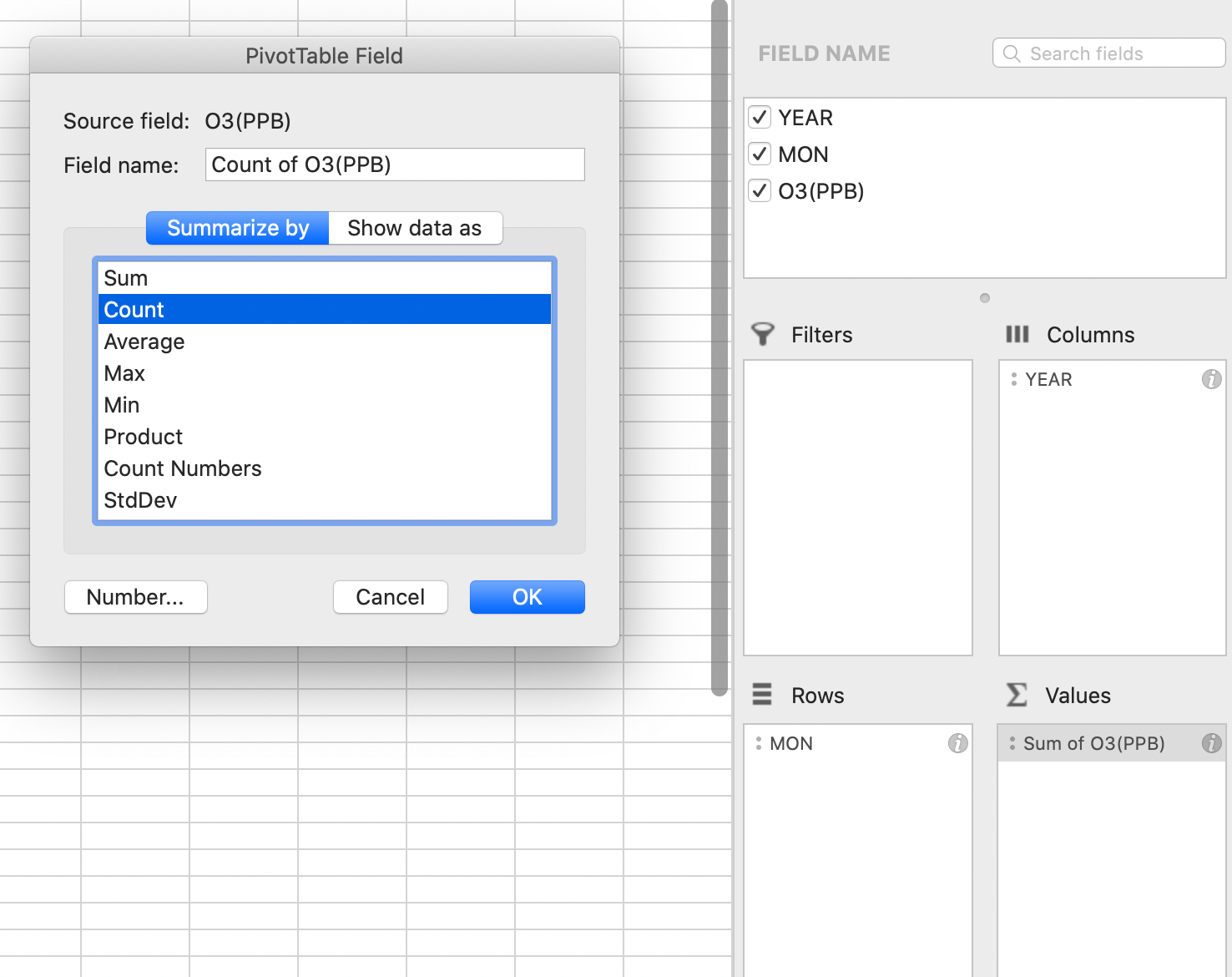
Label the new Worksheet as Ozone_Pivot_Table or similar to begin creating the aggregate summary. Locate the right-hand side panel labelled “PivotTable Fields” and you will see our three metadata headings of “Year”, “Mon”, and “O3 (PPB)”.
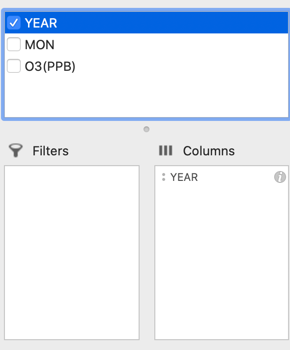
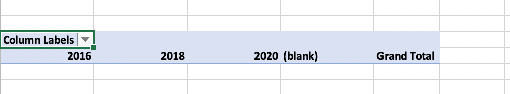
First drag the “Year” data to the “Columns” box and the spreadsheet should look like the below images.
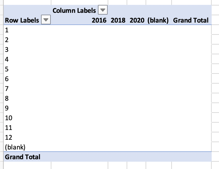
Next, drag and drop the “Month” column into the rows section of the PivotTable.
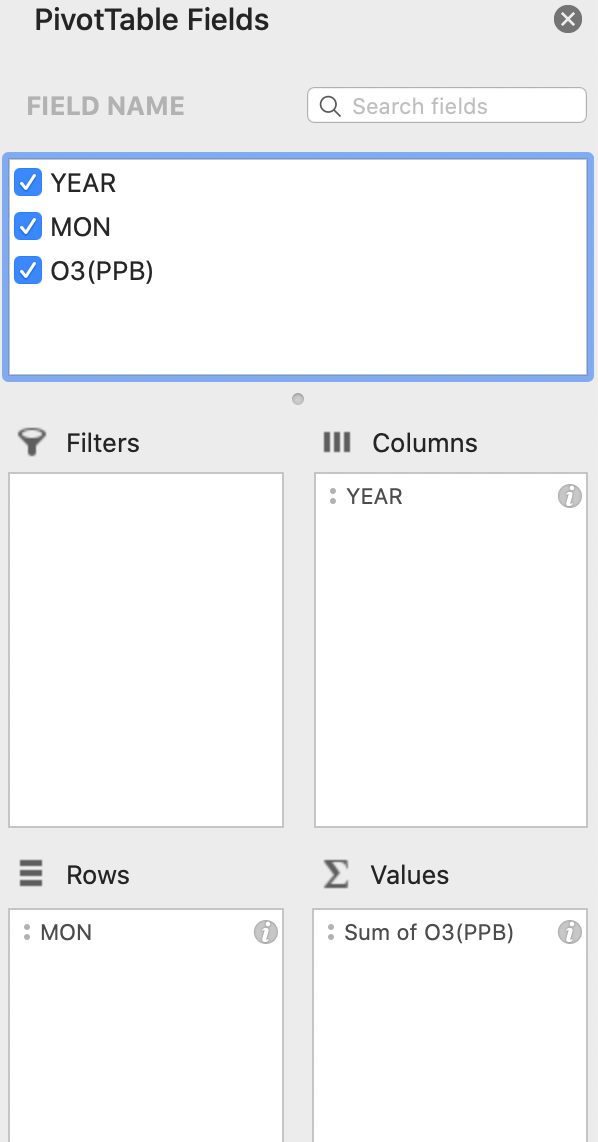
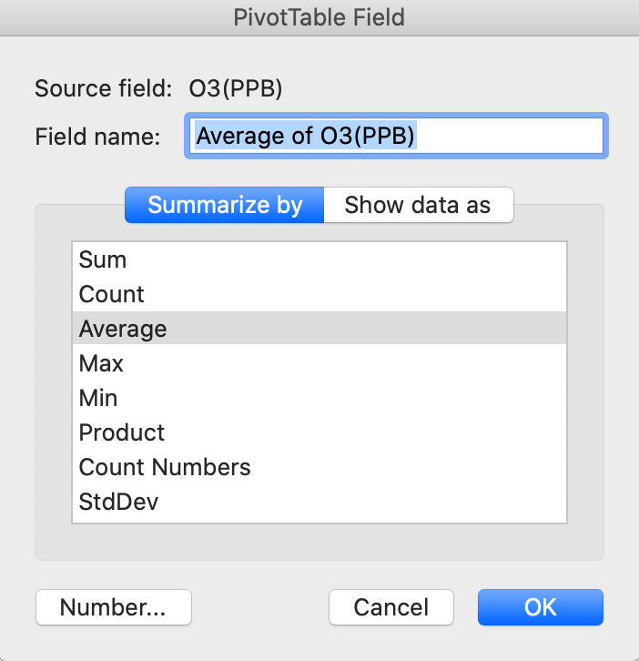
Finally, drag and drop the Ozone values (PPB) to the “Values” panel and click on the “i” in the right-hand corner of the box. The default is to sum the columns and the function needs to be adjusted to Average (or Mean).

The resulting table should look like the below screenshot. If it does not, go back through the steps above to see where the error may be.

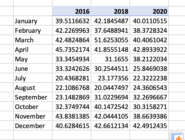
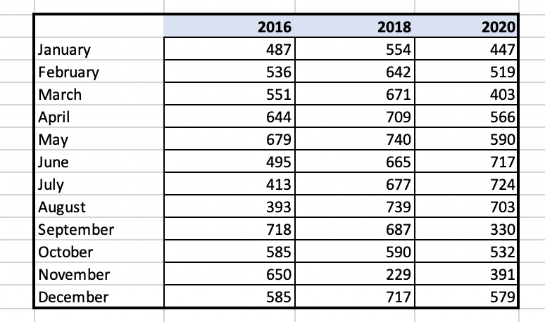
Copy and paste this table over to a final tab called Ozone_final_summary. Next, create a summary table and start by writing “January” in one field. Go to the bottom right-hand corner of that cell until you see a “+” function. Once the “+” appears, drag down the column until you have all of the months of the year. This will simply change the data for graphing so that “1” month corresponds with “January”. Excel links cells by using the “=” function.
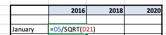
In the first cell under column 2016 and row January, link the value in the summary table “39.511” by entering the cell letter and number (eg. C7) and hit enter. This linked value should appear in the cell. Then use the same “+” to drag this linking formula across and then down to complete the table so all cells are linked to the above summary table. Make sure that Excel has executed this function correctly and has not copied cells instead. The table should now look like the below example.
Return to the original Data Master file and look at the number of significant figures that the original data was recorded in.
How many significant figures does the original Ozone (PPB) instrumentation report the measurements to?
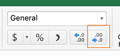
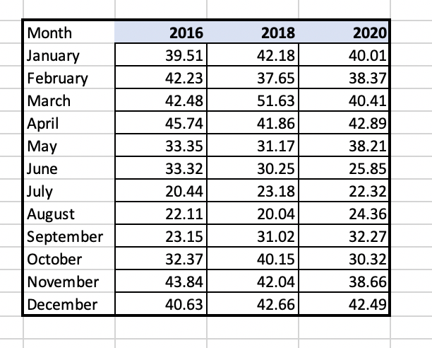
Reduce your data table to the correct number of significant figures utilizing the function outlined in the below located on the “Home” table under “General dropdown” . The summary table should look similar to the below.
Looking at the data summary table, does Ozone (O3) appear to yield higher values in PPB in the summer or winter?
Standard deviation is a measure of the amount of variation or dispersion of a set of values from the mean (or average) of a set of numbers. A low standard deviation indicates that the values tend to be close to the mean of the set, while a high standard deviation indicates that the values are spread over a wider range. The smaller the standard error, the more representative the sample is of the overall measurement in a given length of time.
To create a PivotTable for standard deviation, go through the same steps outlined in Step 5 and when you get to the point of choosing “Average” for the O3 values chose StDEV instead. The table should look similar to the below.
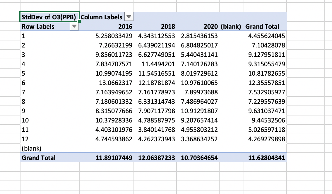
As with Step 5, create a final summary table with the correct number of significant figures. When linking the summary table to the PivotTable make sure to use (= and then link to the cell reference eg. C7) and hit enter and drag down and across using the (+) in the bottom right-hand corner of the first cell. The final version should look similar to the below.
Is the standard deviation higher (more variable) in May or December?
The standard error is traditionally the statistic that is reported utilizing error bars on graphs. This statistic serves as a measure of variation for random variables, providing a measurement for the spread. The smaller the spread, the more accurate the dataset. The relationship between the standard error and the standard deviation is such that, for a given sample size, the standard error equals the standard deviation divided by the square root of the sample size.
SE = σ / √n
Where:
In the case of the Ozone data presented, the sample size is the number of Ozone (O3) readings taken in each month. This can be calculated easily with the “Count” function within PivotTables.
To create a count table, repeat all steps as done in Step 5 (Average) and Step 6 (StDEV) and instead choose “Count”.
Complete the same steps to create the summary table as in step 5. These numbers represent the sample size in each month and year for Ozone and will be utilized to calculate the standard deviation manually in preparation for the final graphing function.
Calculating the standard error will be done manually by taking the standard deviation that has already been calculated and dividing this number by the square root of the sample size which was calculated using the “Count” function in this step.
Create a new sheet to calculate standarad error and copy the final summary table for standard and deviation and count. Make sure to copy and “paste special” and select “values”. Double check to make sure that the table has copied correctly across. Create a summary table for the values to be calculated in for each cell.
What is the sample size in January of 2016?

The final summary table should look similar to below. If it does not, ensure that all of your values are copied and that paste special “values” was utilized to copy values. It is also valuable to go back to make sure that all cells were linked properly versus.

Graphs are a data visualization tool that are an effective way to present information quickly and easily and are commonly used for print and electronic media. Graphs can reveal trends and comparisons that may be difficult to visualize in a table.
To create the final summary tables for graphing you will need two sets of values.
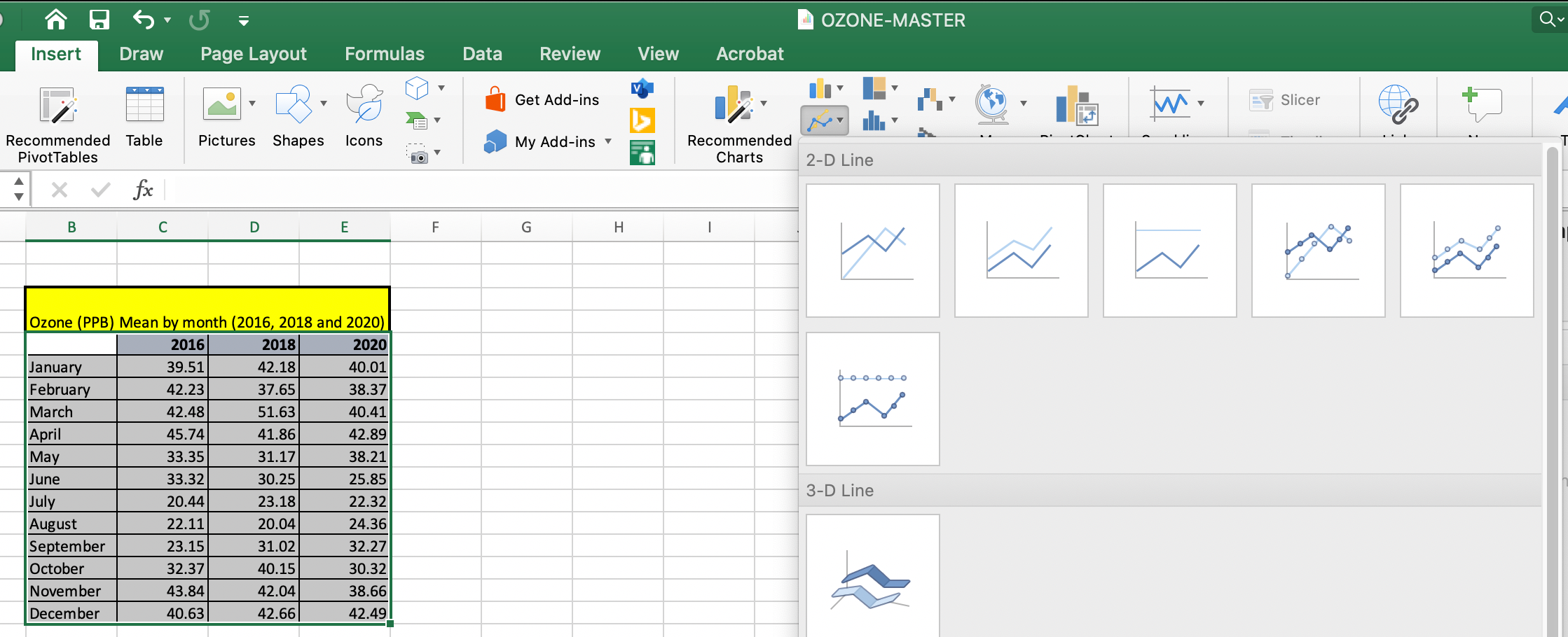
To create the graph you will copy and paste these two summary tables into a new worksheet named “final_summary_for_graphing”. Highlight your summary data table including averages for months and years for Ozone (PPB). Navigate to the Insert tab at the top of your Excel window and choose “2D line” and chose the first option.
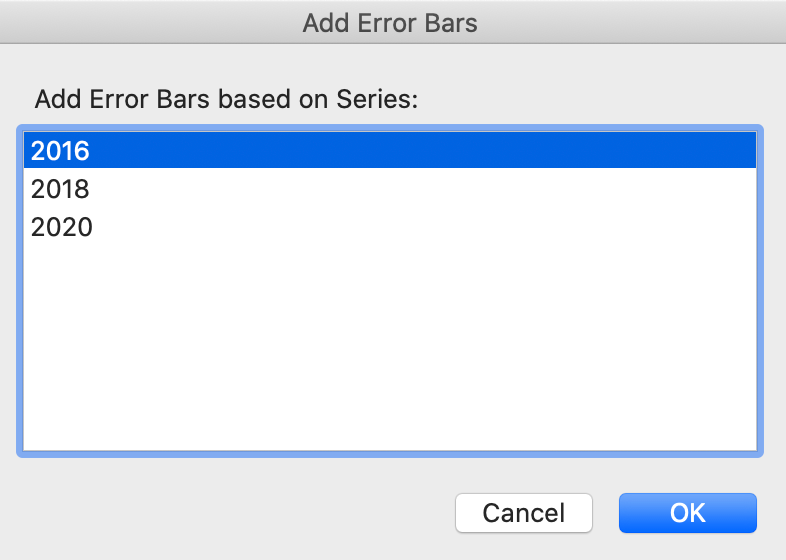
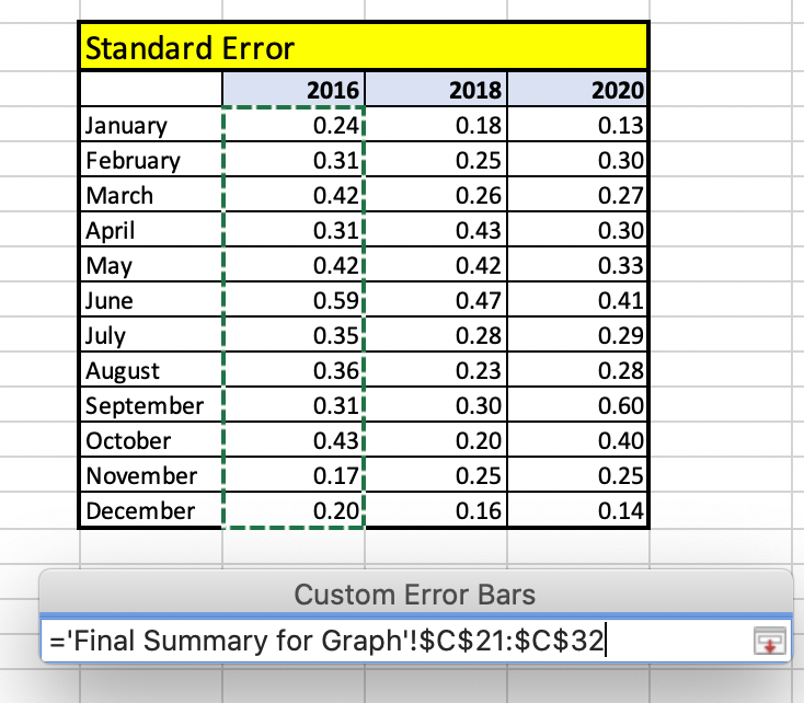
The second step is to add the standard error to each individual year. Navigate to the Chart Design in the icon in the bar at the top of your screen, select “Add Chart Element” and select “Error Bars”. A window will come up to select which series to add Error bars to. Select “2016” and select “ok”.
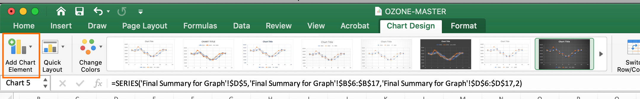
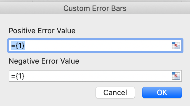
The error for each data point in each month of each year has already been calculated around the mean manually in step 6. To customize the error bars based on calculations navigate to the far-right hand side of the screen to select “Custom” and select “Specify Value”. Ensure that there is a location to add the positive and negative values or “tails” of the error bars by making sure that “Both” is ticked under the “Directions” section of the error bar formatting.
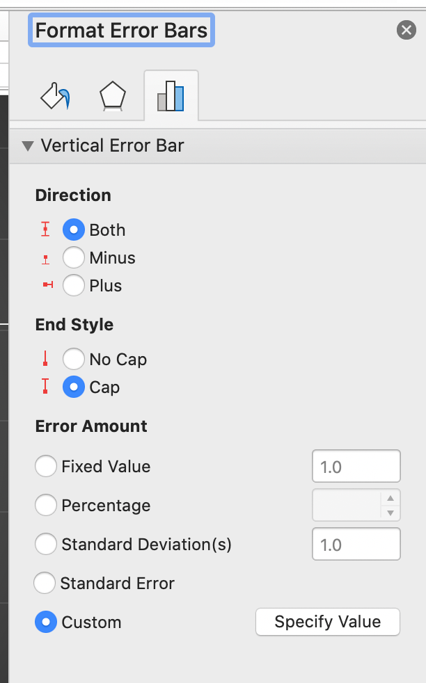
The Customize option will allow a space to highlight both the positive and negative (January – December). Please note as this is normally confusing. To add the (+) and the (-) side of the error bar, select the same column of data Jan-December for 2016 for both (+) and (-) error value.
Proceed to add error bars for 2018 and 2020 data series utilizing the same steps as above. Select the chart element icon to add axis titles to the primary vertical and primary horizonal axis with units and add a descriptive title at the top of your graph. Save the graph as a .PDF to hand in or for further discussion in class. Ensure font sizes are legible for the reader.

In which season is Ozone lower in Bermuda the summer or winter?
How do these data compare to the Ozone trends in other locations? Explore some datasets at other latitudes in DataViewer?
https://gml.noaa.gov/dv/iadv/index.php
Bermuda, like other locations experiences seasonal variation in Ozone concentrations. Hypothesize why this may be?.
https://gml.noaa.gov/dv/iadv/index.php